- Home
- About Me
- My Work
- What I Do
Design & Development
Digital Marketing
Consulting & Speaking
- Weekly Blog

June 20, 2017

While the healthcare industry tend to be slow adopters of digital marketing, there are several Windsor-Essex dentists, chiropractors and optometrists who are breaking-form and creating some of the most well-designed healthcare websites in the area. The websites of these healthcare professionals are not only well designed, but also provide a simple user experience across all mobile devices, make use of great call-2-action buttons and include branding to match the business personality.

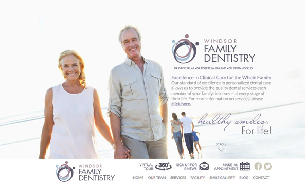
Website: Windsor Family Dentistry
The design of the Windsor Family Dentistry website is what we call a “one-page” design. When navigation links at the top of the website are clicked, the page scrolls to that area of the page rather than opening a link to an entirely new page. This keeps the information on the website concise and keeps the user from having to visit multiple pages to retrieve information. Speaking of the navigation, it “sticks” to the top of the page and includes call-2-action links for a virtual tour, e-newsletter and book an appointment. Links like these should always be in a prominent area of a website and what’s more prominent than the top of the page. Due to the “one-page” nature of the site, it is also very interactive. Click any of the dental services and more information will appear directly below the icon.

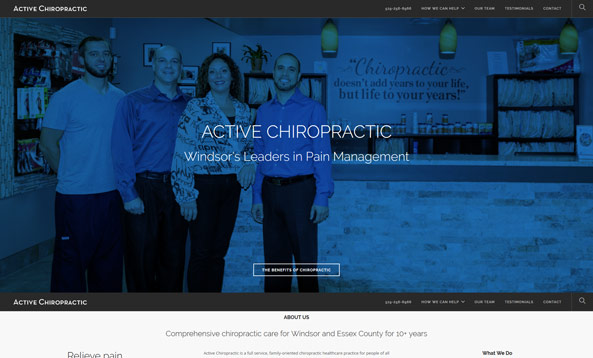
Website: Active Chiropractic
The Active Chiropractic website is about as close as you can get to a one-page website without actually being a one-page website. Similar to the Windsor Family Dentistry website, the navigation links at the top of the page scroll down to that area of the page, however when you get down to that section and click a link within it, you’re brought to a separate page with more information. The testimonial section on the homepage of the website is prominent, real and includes a photo and the name of the happy patient. The addition of high-resolution photos of Dr. Angelini and staff to the website give it a personal feel and give patients an opportunity to match a name with a face prior to their appointment.

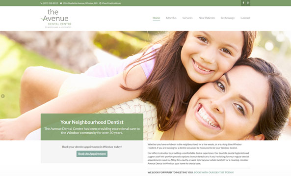
Website: The Avenue Dental Centre
The minimal design of The Avenue Dental Centre website fits perfectly with their brand. The book an appointment above-the-fold of the homepage is in the perfect position and instantly draws your eye to it. If you do happen to scroll past it, there’s another one within the Footer of each page on the website. While the homepage of the website uses high-resolution stock photography to promote their services, each internal page features photos of Dr. Werner and Dr. Whitney along with staff and patients. The content on the website is also very well written and always servers a purpose. Take the your first visit page for example. It provides information on the expected length of your visit, forms you have to fill out and how the process of your first visit will go.

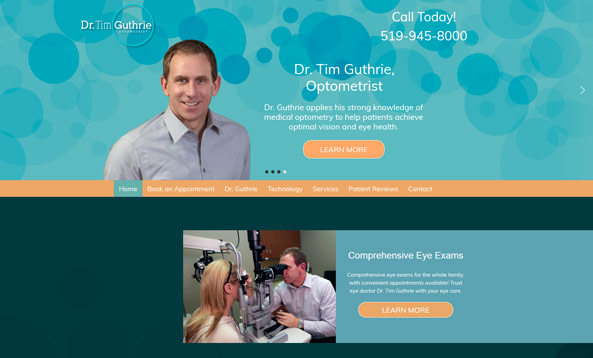
Website: Dr. Tim Guthrie, Optometrist
Sometimes matching your website to your brand is a difficult task, but Guthrie Optometry does a fantastic job. You’ll find the “circle” from the Guthrie Optometry logo throughout the website in the featured content slider, background images and even the curves on the buttons. Patients can choose which day they’d like to book their eye exam appointment directly on the website and even leave a review using a system called “Smile Reminder”. Similar to all the other healthcare websites I’ve used as examples, Dr. Guthrie uses high-resolution photos of himself and his patients throughout the website to add a personal feel.
Topic: Web Design
Written By: Sebastian Agosta