- Home
- About Me
- My Work
- What I Do
Design & Development
Digital Marketing
Consulting & Speaking
- Weekly Blog

October 25, 2017

Did you know that in 2016 there were over 775 craft brewing facilities in Canada? That’s an increase of 20.3% from 2015! It’s no secret that craft breweries are becoming more and more popular as casual drinkers and beer connoisseurs alike search for their next tasty libation.
The growing trend of craft breweries is just as popular locally in Windsor-Essex. It’s grown so popular in fact that Tourism Windsor Essex Pelee Island (TWEPI) has setup a #BarrelTrail (called Barrels, Bottles and Brews) which encourages visitors to tour our local breweries and collect stamps to redeem prizes.
After attending the Windsor Craft Beer Festival over the weekend of October 13th-14th and seeing some of the creative branding developed by the breweries, I decided to take a look at their websites and see if that creativity carried over to their digital marketing.

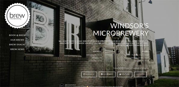
Website: BREW Microbrewery
The BREW Microbrewery website is a minimalist design that fits perfectly with their brand. Rather than use paragraph after paragraph of content do describe their company, they simply use 3 words “Easy Drinking Beer”. Having the navigation “sticky’d” to the left side of the page allows users to easily scroll through the website on the right side while still being able to navigate to other pages at any point during their scroll. Using high-resolution background images of their brewery on each page is the perfect personal touch to give users a feel for the brewery and the people involved.

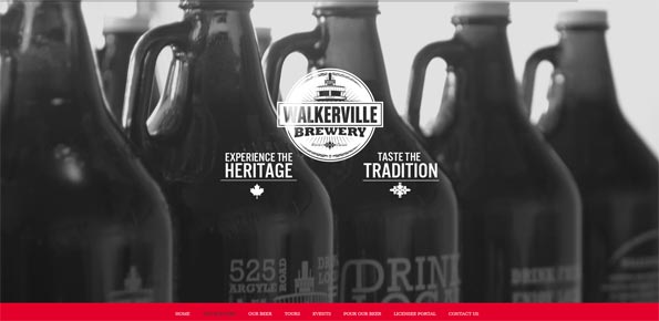
Website: Walkerville Brewery
Of the 4 websites I’ve added to this list, I’d say Walkerville Brewery is the most polished. Everything about it is consistent from the straight lines of content to the various heading colours and sizes to mouseover and click effects. The website itself is a bit of a hybrid between a one-page scrolling website and a multi-page site. The majority of links at the top use a jQuery scrolling effect to take a user to a particular section of the homepage, however there are a few navigation links that take you to a separate page altogether. The black & white background images used in the featured content area at the top of the page are placed perfectly and catch your eye just enough before moving on to the rest of the page.

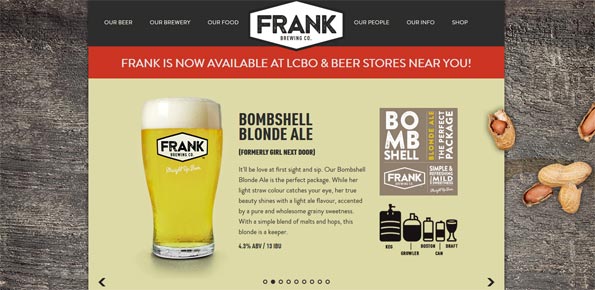
Website: Frank Brewing Co.
If you’ve ever been to Frank Brewing Co. you know that peanut shells are a staple of the bar and restaurant. That staple is carried over to the website by having the background of the centre-aligned website littered with peanut shells. Unique to the Frank Brewing Co. website, is the dual featured content slider. One static slider for the various types of craft beer which only transition upon a user click and a second for deals and promotions that transitions automatically. In order to keep users on the one-page scrolling website, there is also a section of 4 squares (Shop, Brewery, People & Menu), which when clicked take over that section to display more content.

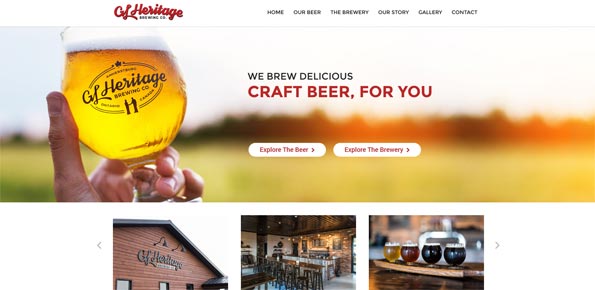
Website: GL Heritage Brewing Company
I’m a big fan of websites that utilize the entire width of the high resolution screens we have these days and GL Heritage Brewery Company is one of those websites. Both the featured image at the top of the homepage as well as the third section detailing their various brews both span the entire width of the page, leaving very little background area. The featured slider includes two call-2-action buttons which lead users down two distinct paths, “Explore the Beer” and “Explore the Brewery”. I also love the “Find Us Here” map on the “Our Beer” page which helps users find where in Windsor-Essex County GL Hertitage beers are sold. It even includes the address, phone number and website of each location. Awesome!
Topic: Web Design
Written By: Sebastian Agosta