- Home
- About Me
- My Work
- What I Do
Design & Development
Digital Marketing
Consulting & Speaking
- Weekly Blog

February 7, 2017
It’s great to see how many restaurants in Windsor-Essex County have embraced the importance of digital marketing in 2016-2017. So many of the restaurant websites I visited while researching for this blog had such great designs and functionality that it was hard to narrow it down to just 5. I didn’t come up with any formal criteria on how I determined a “stunning website design” but most of these sites had several things in common – read on to see what those things were.
Designed By: Christopher Pressey
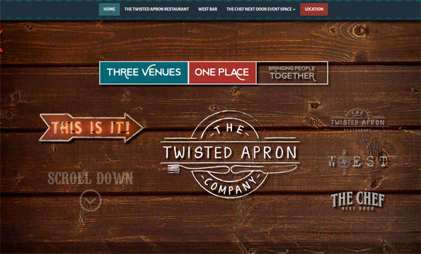
The Twisted Apron website has a unique design that fits perfectly with their overall branding and marketing. It may appear to be a one-page scrolling website, but it’s actually so much more. Click any of the 3 links at the top of the page and you’re brought to specific landing pages for The Twisted Apron Restaurant, Bar and Chef Next Door event space. The interactive features throughout the site keep it interesting and the social media integration keeps users engaged and up-to-date.

Designed By: Stature Marketing
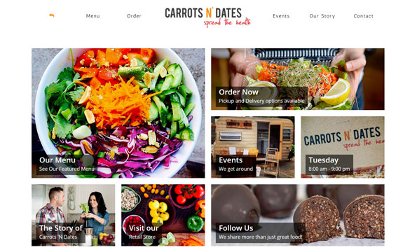
The Carrots N’ Dates website has a photo-centric design that showcases their nutritious menu items. They elected to stay away from a long scrolling website by keeping almost all content above the fold. The layout of the rectangular picture boxes translates incredibly well when visiting from a smartphone or tablet thanks to responsive design. They’ve also incorporated an online ordering system via Get Spoon Fed which allows website visitors to order their food and have it delivered straight to their door!
Designed By: Spry Agency
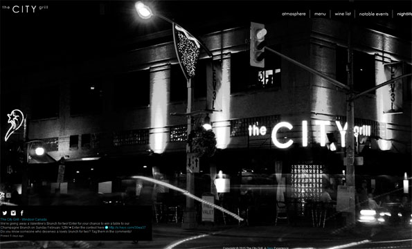
When it comes to overall digital marketing there may not be a better restaurant in Windsor-Essex than The City Grill. Not only is their website sleek and simple to use but they also incorporate a lot of online marketing. When the website is first loaded, a welcome screen appears with their latest event or promotion (currently Valentine’s Day). Once you opt-in or close that promotion you’re brought to a one-page website that features brilliant photography, newsletter signup, social media feeds and information on their latest awards and accolades. The site may not be a responsive design but fear not, they have a mobile-ready version for smartphone users.
Designed By: Duane Neveu
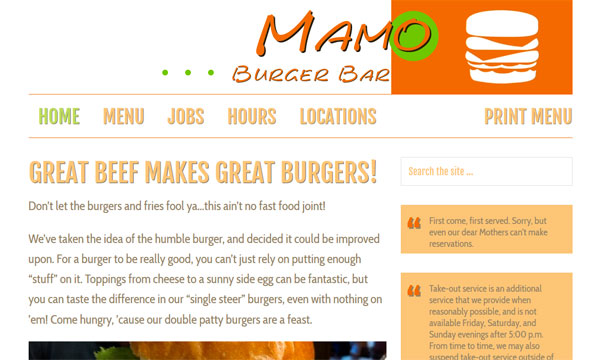
Another website where the design matches the overall brand look and feel. The Mamo Burger Bar website makes use of different font sizes and weights to bring the typography to life. I love the almost-too-big font-size choice for the navigation menu and headers. Once you dive a little deeper into the menu area of the website you’ll find that it’s not a simple PDF but also coded directly into the page. This makes it easy for anyone on a smartphone or tablet to view the menu the same way you would on your desktop or laptop computer screen – no stretching, no skewing.
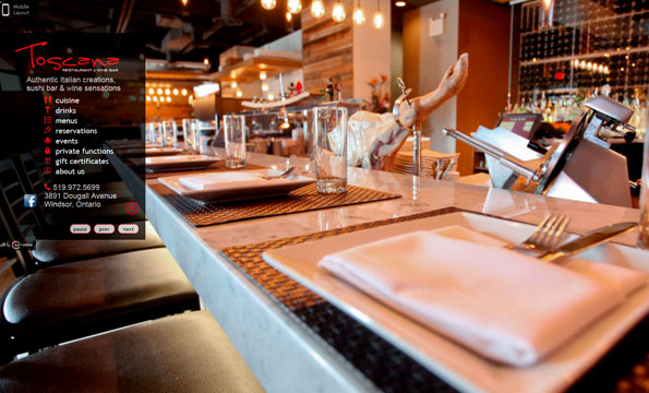
Designed By: Carrabino
Similar to The City Grill website, Toscana also uses a one-page, no-scrolling design. The ability to flip through and change the main background image allows users to check out the different areas of the restaurant giving them an idea of the layout and atmosphere. The navigation menu keeps things short, sweet and to the point offering brief information with each click. A mobile-ready version of the website is also available for anyone visiting from a smartphone.
Topic: Web Design
Written By: Sebastian Agosta