- Home
- About Me
- My Work
- What I Do
Design & Development
Digital Marketing
Consulting & Speaking
- Weekly Blog

December 20, 2011

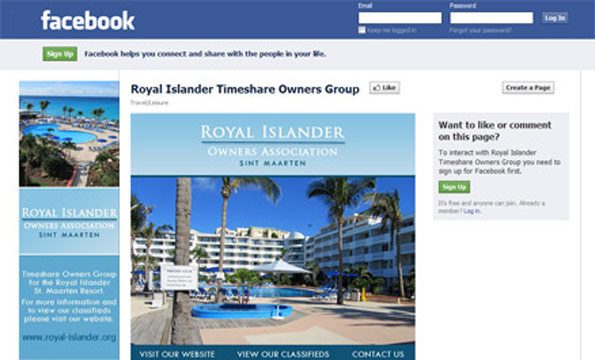
Busy, busy, busy! That’s what I’ve been since my last blog post a couple months ago! I apologize for neglecting my blog over that time, but I swear I’ve had good reason to! I’ve been busy the past couple months coming up with web designs for local businesses Forte Professional Services and Elegance By Design (Previews and live examples of both should be ready by the new year). The other projects that have been keeping me busy are Facebook business page designs! If you’ve been following my Facebook page or Twitter account, you’ve probably noticed posts about Facebook fan pages for Windsor Squash & Fitness, Royal Islander Owners Association and Natalie Cervini Chiropractor. Clicking any of those links will take you to their Facebook business page which I designed.
There are several ways for businesses both small and large in the Windsor Ontario area to enhance their Facebook page design. One of the first ways I always suggest to my clients is to create an extended profile banner. This is the first item required by Facebook when designing a page and is located in the top-left hand corner of your page. You can add basically any sized image in there and Facebook will re-size it to fit or you can have a web designer (like me) create an extended profile banner which is at most 180px (wide) x 540px (high). You can see examples of the profile banners I’ve designed below.
Another great way to enhance your fan page is to create a “welcome” tab. You can set this tab to be the first thing users see when they visit your Facebook page. This tab can be any size you want, however if you create one that is wider than 510px, chances are Facebook will add a scrollbar to the bottom of it by default. What’s nice about the welcome tab is that it can be created to give the user the illusion that they “must” Like your page before moving forward. Without a welcome page on your Facebook, users will automatically be directed to your Wall, where they can get all the information about your business without having to Like it first.
The last suggestion I usually make to my clients is that they add 5 images 98px (wide) x 68px (high) to an album titled “Profile Banner” or something along those lines. These images should be about the business in some way shape or form. For example, on my Facebook page, you’ll notice (if you’ve Liked it) I have 5 images across the top. These 5 images are of 5 web designs I’ve done over the past year. If you don’t add any images at all, people who have Liked you page will see blank images which is really just a waste of quality Facebook page space! (My apologies for the rhyme)
If you’re a business in Windsor and have a Facebook business page, you should definitely have at least 1 of the suggestions I’ve listed above. If you don’t, you could be missing out on potentially reaching thousands of new customers on a regular basis.
If you’re interested in having a Facebook page designed by me, please email me or call 519-995-7329. I have extensive experience in designing these pages and offer the most affordable rates in the city!
Topic: Web Design
Written By: Sebastian Agosta